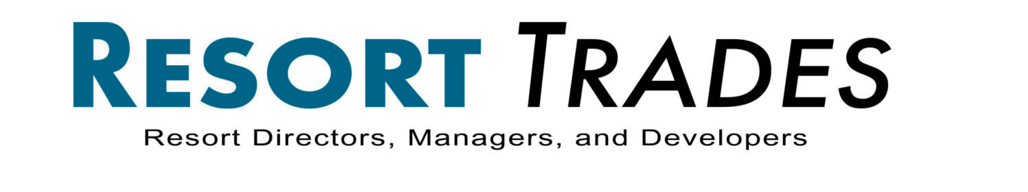
Seeing Red: The history, symbol, and use of the color red
Working in leadership can inevitably lead to moments of “seeing red.” But seeing red isn’t always as bad as the idiom suggests. In fact, the color is as rich in meaning and history as it is in symbols. There is a reason we associate this primary color with different emotions and occasions. Understanding what is behind the color will give you a better idea of where and when to best employ it at your Resort.
First Impressions
Did you know? Red is the first color we begin to see as we develop sight, after black and white. It is a primary color, which means it is one of the three colors that mix together to form all other colors. Red can be a warm color (leaning towards yellow) or a cool color (leaning towards blue). Red is also known to be the first color mastered and reproduced by artists.
Mixed Feelings
Red is an intense hue and brings about the strongest reactions of all the colors. It is so dynamic it can signal a range of emotions that include opposites — the happiest of feelings and the worst. The potent color can evoke all of the following:
- Strength
- Power
- Passion
- Desire
- Love
- Vigor
- Romance
- Aggression
- Dominance
- Courage
- Luck
- Joy
- Prosperity
- Celebration
- Danger
- War
- Anger
- Rage
- Sacrifice
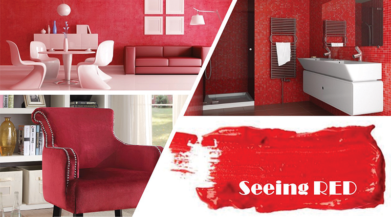
Much meaning stems from the fact that red is the color of blood and the heart, therefore cultures across the world and all of the time identify the color with feelings of love and passion. In Chinese philosophy, red is tied to the element of fire; linking it to leadership, confidence, and good fortune. In India, red signifies marriage, as a bride wears red on the wedding day. With such varied emotions and symbolism coming from a single color, it may not surprise you to learn there are 445 shades of red each individually named.
Get to the Source
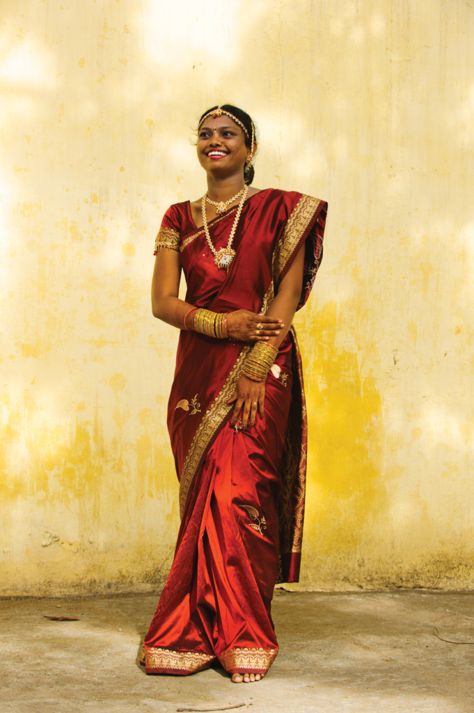
The first use of the color red for decoration was 20,000 years ago when pre-historic peoples ground clay of red ochre to make the first known artwork- cave drawings – throughout Africa, Asia, and Europe. Shades of red multiplied with the discovery of Cinnabar from the ore of mercury. Romans decorated their villas with frescos of deep red vermillion derived from Cinnabar, mined by prisoners in Southern Spain. Cinnabar is highly toxic and the task of mining usually ended in death. No wonder the color is connected to both Power and Danger!
Less toxic means of achieving red in textiles came from the Rubia Plant roots and Madder seeds. Known worldwide, the natural compound in the plant was used in regions of Asia, Europe, and Africa as early as mummification in Egypt. The Aztecs had their own method for creating a vivid red. They gathered Conchineal bugs found on cacti, dried and crushed them to create both dyes and paint. Once we found ways to create the synthetic red dye, the possibility of application became almost endless.
Employ it Right
With such an attention-grabbing color, you don’t have to wonder why it has been used in branding. But is it right for your Resort Branding? True Red is mostly associated with 3 types of brands: Health brands, Restaurants (particularly fast food), and brands wanting to convey power and energetic emotions. It may not be the right color for your next rebrand, but it CAN be put to good use in your interiors.
Put it to Work
When thinking of your next Interiors refresh, remember — A little bit of Red can go a long way! This can be helpful if you are working with a tight budget because it will create a big impact. Classic Red well placed in artwork, accent fabric, or a lampshade can easily punch up an otherwise dull color palette. Start small with Classic Red.
Don’t forget! There are 445 reds to choose from, the right one for your Resort interiors. Red can be used in any style – Modern, Traditional, Contemporary, or Classic. If Fire Engine red isn’t right for you, a darker hue like burgundy, maroon, or wine might be the right fit to convey sophistication. Warmer hues like coral, rust, and auburn might be a better fit if yours is a playful resort.
No doubt the right use of red can be overwhelming with so many factors at play. That is why I always recommend working with a design professional to make sure you get it right. We are trained in color theory and application and know just how to Roll Out the Red Carpet!
Author Bio: Margit Whitlock is Principal and Creative Director for Architecture and Interior Design at Architectural Concepts Inc., a San Diego, CA based Architectural and Interior Design Firm specializing in hospitality design. Ms. Whitlock is an accomplished speaker with engagements at multiple ARDA conventions, HD Boutique show as well as being frequently published in magazines such as Developments, Resort Trades, Hotel Business, Hiatus, Vacation Industry Review and Resort Management and Operations.